Navigation Patterns That Reduce Friction
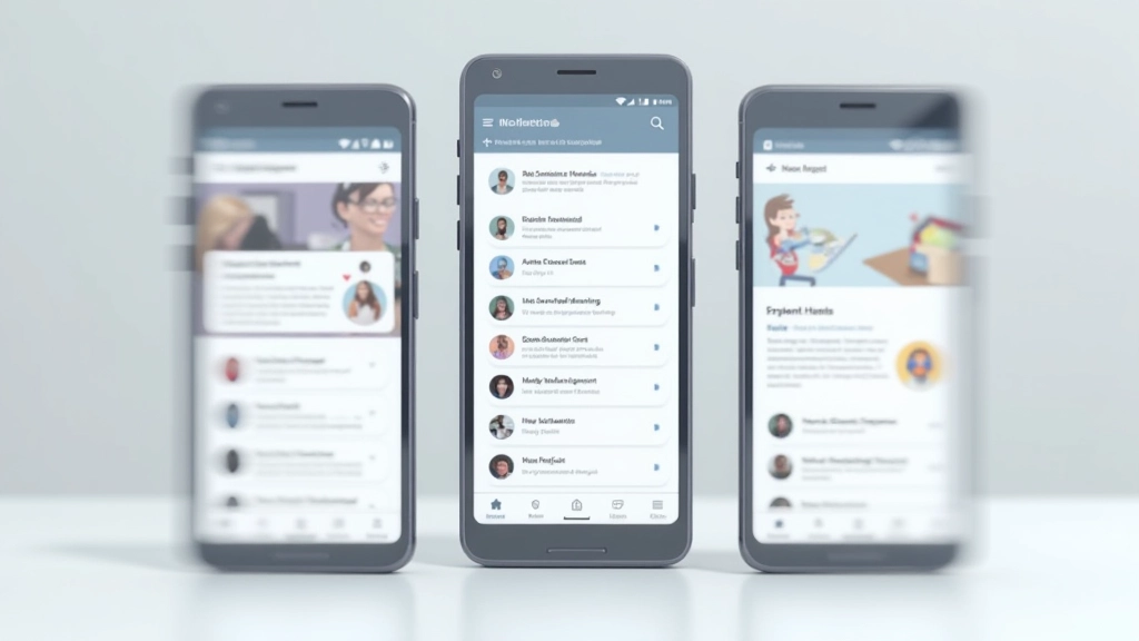
Bottom navigation, hamburger menus, tab bars — each works in different situations. Learn which pattern fits your users and how to implement it so people actually find what they need.
Read ArticleLearn how to structure your mobile design so users naturally move toward your key goals. We’ll cover layout principles, touch targets, and the one mistake that kills engagement.

Here’s the thing: designing for mobile isn’t just about making things smaller. It’s about being ruthless with what matters. When you’ve got 320 pixels of width and people are scrolling with their thumbs, every decision counts.
Users don’t come to your site to admire your design. They’re there to accomplish something specific — whether that’s finding information, making a purchase, or booking an appointment. On mobile, they’ll abandon you in seconds if the path isn’t clear. We’re talking about 53% of visits bouncing if pages take more than 3 seconds to load.
The best mobile interfaces don’t feel designed at all. They feel inevitable. The call-to-action is exactly where you’d expect it. The navigation makes sense. Forms don’t ask for unnecessary information. This isn’t accident — it’s intentional structure built around how people actually behave on small screens.

Most mobile design fails because it tries to do too much. The successful ones follow a simple hierarchy: one primary action per screen, supporting content below, everything else hidden behind menus or later steps.
Let’s break down what actually works. First, thumb zones matter more than you think. On a 6-inch phone, the bottom third is where your thumb naturally rests. That’s prime real estate. Your most important action should live there — not at the top. Yes, we know convention says navigation goes up top, but that’s desktop thinking.
Second, white space isn’t empty. It’s breathing room that makes interfaces feel fast and responsive. Cramped mobile screens feel slower. Even though you’ve got limited space, generous padding around buttons and text actually improves engagement. Users know where to tap. Mistakes drop.
Third, progressive disclosure — showing only what’s necessary right now. Don’t load the entire product roadmap into the initial view. Show the core action. If someone needs advanced options, they’ll look for them. This isn’t hiding features; it’s respecting attention spans.


Here’s what we see constantly: designers add fields “just in case.” Company name. Phone extension. Billing address when it’s optional. Each extra field drops completion rates by 3-5%. For a form with 8 fields instead of 4, you’re looking at 15-20% fewer submissions.
But there’s something worse than extra fields — it’s unclear next steps. Users don’t know what happens after they tap that button. Will it charge them? Send a confirmation? Take them to another form? The friction builds. Add a one-sentence explanation below your primary action. “Submit to get instant quote” instead of just “Submit.” That one detail drives 12-18% higher completion rates.
Touch targets are equally critical. The minimum should be 4444 pixels. That’s about the size of an adult fingertip. Smaller buttons feel risky. Users mis-tap and get frustrated. If you’re seeing unusual abandonment rates at specific points, measure your interactive elements. We’d bet they’re undersized.
Mobile-first responsive design isn’t just about making things stack vertically on phones. It’s about rethinking the whole layout strategy. Start with what works on the smallest screen. That forces you to prioritize ruthlessly. Then, as screens get bigger, you have permission to add complexity.
The best pattern we’ve seen uses a single-column layout for everything under 640 pixels. No multi-column grids. No side-by-side elements. Just content flowing top to bottom. Users scroll — that’s fine. They expect it on mobile. What they don’t expect is horizontal scrolling or pinching to read text.
Between 640-1024 pixels, you can introduce two-column layouts for specific sections. Cards sit side-by-side. Images and text pair up. But keep the primary action always visible and full-width. Once you hit desktop (1024+), you’ve got freedom. Navigation can expand. Sidebars appear. But the core structure you built on mobile still holds everything together.
The key: Don’t design for desktop first and shrink it down. Design mobile. Build it. Then enhance it for larger screens. The mobile version teaches you what’s actually essential.


You don’t need expensive lab setups. Watch 5-8 people interact with your mobile site on their actual phones. Not tablets. Not desktop browsers pretending to be mobile. Real phones. Real hands. Real interruptions (they’ll check notifications mid-task).
Look for these three things: Can they find the primary action in 3 seconds? Do they tap the wrong button? Do they scroll past important content? If the answer to any is “yes,” you’ve got structural problems. Fix them before shipping.
Tools like Hotjar or Crazy Egg show you where people actually tap, how far they scroll, and where they abandon. You’ll discover patterns that intuition misses. Maybe that beautifully designed icon nobody recognizes. Maybe that button that’s two pixels too small to feel comfortable tapping. The data points you to exactly what needs refinement.
Mobile-first design isn’t a constraint. It’s clarity. When you design for the smallest screen with the least attention, you strip away everything that doesn’t matter. The result feels fast, obvious, and intentional.
Start with one screen. What’s the one action that matters here? Make that obvious. Everything else supports it. Add white space. Test with real people. Watch where they struggle. Fix it. Repeat.
The mobile interfaces that convert aren’t flashy. They’re not trendy. They’re just well-structured, thoughtful, and built around how humans actually behave on small screens. That’s it. That’s the whole game.
Ready to audit your mobile experience? Start by testing with 5 real users. You’ll learn more in an hour than from any framework.
This article provides educational information about mobile-first interface design principles and best practices. The specific metrics, conversion rates, and user behavior patterns mentioned are based on industry research and observed trends, but actual results will vary depending on your specific context, audience, and implementation. Always test strategies with your own users and measure results against your unique business goals. Mobile UX design is evolving constantly, and what works today may need refinement as technologies and user behaviors change.